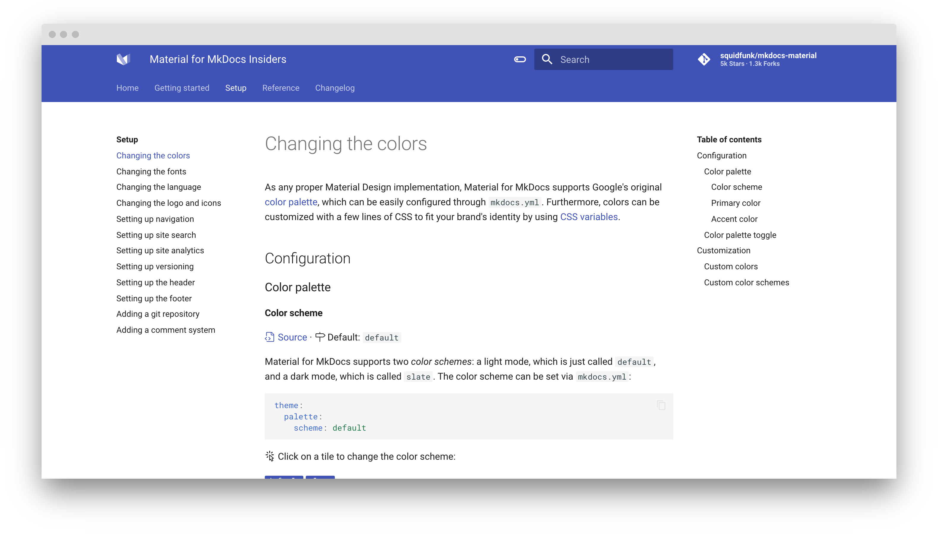
Changing the colors
As any proper Material Design implementation, Material for MkDocs supports Google's original color palette, which can be easily configured through mkdocs.yml. Furthermore, colors can be customized with a few lines of CSS to fit your brand's identity by using CSS variables.
Configuration
Color palette
Color scheme
Source · Default: default
Material for MkDocs supports two color schemes: a light mode, which is just called default, and a dark mode, which is called slate. The color scheme can be set via mkdocs.yml:
theme:
  palette:
    scheme: default
Click on a tile to change the color scheme:
The color scheme can also be set based on user preference, which makes use of the prefers-color-scheme media query, by setting the value in mkdocs.yml to preference:
theme:
  palette:
    scheme: preference
Primary color
Source · Default: indigo
The primary color is used for the header, the sidebar, text links and several other components. In order to change the primary color, set the following value in mkdocs.yml to a valid color name:
theme:
  palette:
    primary: indigo
Click on a tile to change the primary color:
Accent color
Source · Default: indigo
The accent color is used to denote elements that can be interacted with, e.g. hovered links, buttons and scrollbars. It can be changed in mkdocs.yml by choosing a valid color name:
theme:
  palette:
    accent: indigo
Click on a tile to change the accent color:
Accessibility – not all color combinations work well
With 2 (color schemes) x 21 (primary colors) x 17 (accent color) = 714 combinations, it's impossible to ensure that all configurations provide a good user experience (e.g. yellow on light background). Make sure that the color combination of your choosing provides enough contrast and tweak CSS variables where necessary.
Color palette toggle
Insiders can easily add multiple color palettes, including a scheme, primary and accent color each, and let the user choose. A color palette toggle can be added via mkdocs.yml:
theme:
  palette:

    # Light mode
    - scheme: default
      primary: indigo
      accent: indigo
      toggle:
        icon: material/toggle-switch-off-outline
        name: Switch to dark mode

    # Dark mode
    - scheme: slate
      primary: blue
      accent: blue
      toggle:
        icon: material/toggle-switch
        name: Switch to light mode
This will render a color palette toggle in the header next to the search bar:
A demo is worth a thousand words — check it out at squidfunk.github.io/mkdocs-material-insiders
The toggle field allows to specify an icon and name for each palette. The toggle is rendered next to the search bar and will cycle through all defined color palettes:
icon-
Default: none · Required – This field must point to a valid icon path referencing any icon bundled with the theme, or the build will not succeed. Some popular combinations:
- + –
material/toggle-switch-off-outline+material/toggle-switch - + –
material/weather-sunny+material/weather-night - + –
material/eye-outline+material/eye - + –
material/lightbulb-outline+material/lightbulb
- + –
name-
Default: none · Required – This field is used as the toggle's
titleattribute and should be set to a discernable name to improve accessibility.
Customization
Custom colors
Source · Difficulty: easy
Material for MkDocs implements colors using CSS variables (custom properties). If you want to customize the colors beyond the palette (e.g. to use your brand-specific colors), you can add an additional stylesheet and tweak the values of the CSS variables.
Let's say you're YouTube, and want to set the primary color to your brand's palette. Just add:
:root {
  --md-primary-fg-color:        #EE0F0F;
  --md-primary-fg-color--light: #ECB7B7;
  --md-primary-fg-color--dark:  #90030C;
}
See the file containing the color definitions for a list of all CSS variables.
Custom color schemes
Source · Difficulty: easy
Besides overriding specific colors, you can create your own, named color scheme by wrapping the definitions in the [data-md-color-scheme="..."] attribute selector, which you can then set via mkdocs.yml as described in the color schemes section:
[data-md-color-scheme="youtube"] {
  --md-primary-fg-color:        #EE0F0F;
  --md-primary-fg-color--light: #ECB7B7;
  --md-primary-fg-color--dark:  #90030C;
}
Additionally, the slate color scheme defines all of it's colors via hsla color functions and deduces its colors from the --md-hue CSS variable. You can tune the slate theme with:
[data-md-color-scheme="slate"] {
  --md-hue: 210; /* [0, 360] */
}
